Facebook Banner Size: First Impression Matters Most
Getting the right Facebook banner size is vital for social media marketing because anything other than the best is off-putting nowadays! Get the correct dimensions for your banner by reading below!
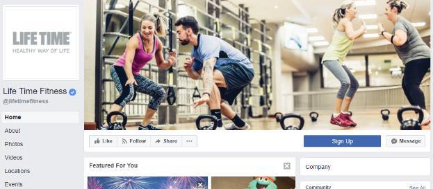
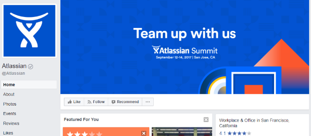
Facebook banners are the first thing that your audience sees when they visit your page. Storytelling might lure in customers by using content to help them grab a better understanding of the brand. But visuals make the most impact when it comes to social media.
Facebook banner images are an excellent illustration of how social media marketing differs from ordinary social media usage. A fantastic personal cover photo maybe anything that we believe looks good on our profile; but, our business cover photographs must accomplish much more.
The Facebook banner for a Page should be branded and represent our company. The right mixture and consistency of web layouts, pictures, and videos uploaded on social media dictate the brand’s purpose, values, and feelings to the public. It must also be of good quality and precisely suited for display, which necessitates understanding the ideal Facebook banner size.
This article will look at the perfect Facebook banner size and optimal cover photo techniques to ensure that your photos accurately represent your company.
The Ideal Facebook Banner Size (Dimensions for Facebook Cover Photos)
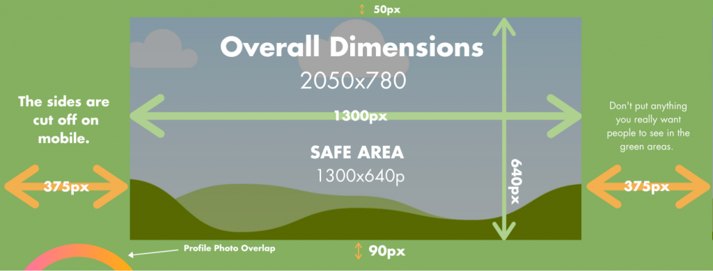
According to Facebook, your cover photo needs to be 820 pixels wide by 312 pixels tall on laptop/desktop screens and 640 pixels wide by 360 pixels tall on smartphones.
No audience, however, uses just one of these two types. People everywhere browse Facebook on their phones and laptops, depending on what is more accessible to them. Facebook banners look different in either of those families of devices. Designers need to design these banners using the ideal Facebook banner size so that information is visible on both smartphones and laptop screens.
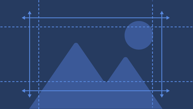
Our recommendation would be to keep the text and graphics in the middle of the picture. It is called the safe zone. All information needs to be in this zone to be visible to everyone in your audience regardless of the device it uses. The illustration below will make you understand in a much simpler way.
Designing a banner with these guidelines could be tricky. One major tip would be: place all the decorative elements around the picture and keep the informative visuals in the middle with flashy colours. It ensures uniformity in the visuals displayed on either of the devices and attracts the audience’s attention as soon as they stumble upon your Facebook page.
A banner may elevate your Facebook Business Page to new heights. Knowing how to develop and optimise your cover photo is critical whether you’re using Facebook to generate leads, close a transaction, or build a customer community. To learn more about your customers on Facebook and how to attract them, click here! And, when you examine the Facebook banner size listed above, it might be a hassle to strike a balance between originality and platform standards.
These are some recommended tips for you to optimise your perfect Facebook banner size:
- The minimum size for a Facebook banner size is 400 x 150 pixels.
- Uploading an sRGB file less than 150kbs in the JPG format yields the best results.
- Images with textual or visual elements like logos look best in PNG formats.
- The perfect banner size for both computers and mobile devices is 820 x 461.25 pixels. It is the best of both worlds as it does not crop the image on any devices and does not blow it up either.
- More than 85% of the users use Facebook on their phones.
Taking these impactful details in mind, marketers need to curate their Facebook banners to attract attention and dissipate information as effectively as they can. But why is it vital to have the perfect Facebook banner size for our pages? Let’s find out!
Benefits of having the Perfect Facebook Banner Size
The perfect Facebook banner size ensures your picture isn’t pixelated or too small for both mobile and desktop screens and that your audience has the best experience seeing it.
- To Drive Sales and Generate Leads:
Your Facebook banner with an appropriate CTA button is an effective way of driving the audience to your website. Any offers or major upcoming events may be visible on your Facebook banners. So customers know about it as soon as they arrive on your Facebook page and take appropriate actions.
- To Display User Generated Content:
Your brand may have fans in your audience that curate brand-specific content. Brands should give them a shoutout by using their content and providing them with credits and royalty if they get any from the public.
- To Display Product Benefits:
It might swing in a little much with sales but displaying the benefits of your products gives you a boost to the sales of your products.
- Present the members of your team:
Employees will get a boost seeing themselves on the front page of their company’s social media page and motivate themselves to work harder!
- To appeal to other B2B pages looking to collaborate:
Content marketing or B2B content marketing works on making the first impression everlasting on a brand that wants to collaborate with you. Having a good Facebook banner makes the personality of your brand crystal clear to these other brands that want to collaborate with you on a project. B2B content marketing strategy templates are available online all over the Internet, so you have no difficulties following the policies provided by Facebook!
Now that we know why it is beneficial to use the perfect Facebook banner size for our pages. Let’s see some guidelines that must be adhered to so our banner is effective in front of our audience.
Guidelines to follow while setting up a Facebook Banner:
- Stick to Facebook’s policies: All the policies and guidelines that are available on Facebook’s support page must be followed to the T to avoid flagging your page’s banner. As your banner is visible to the public, it should not contain any offensive material or anything that might hurt the sentiments of your audience or anyone visiting your page. They should also not be copyright material or mislead your audience in any way. There are several other points to be noted on their guidelines page.
- Ensure your Facebook banner size comes under the required dimensions provided by the platform so your visuals don’t look blown up or get too small!
- Forget about the 20% Rule, but not completely: Facebook has removed the 20% text and 80% visuals rule from their guidelines. It is advisable by many marketers that text should be present to a minimum compared to the visuals in your Facebook banner.
- Use colours that match your brand: It is probably one of the most underrated things you could do for your Facebook banner. Have the colour for your banner be the same as your company’s primary colour to match it with the brand’s tone. Uniformity in visuals is appreciated in all forms of social media and is duly rewardable with proper engagement.
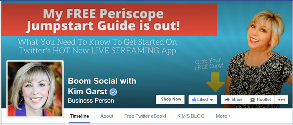
- Right Align Everything: The profile picture of your brand takes up the left side of the viewer’s attention, so creators must design Facebook banners in such a way that all the visuals are on the right side of the picture.
- Make use of the caption for your banner: Facebook lets you edit your captions on your banners. Add a shortened link to redirect users who click on it to your website or products catalogue to ensure engagement on your page through Facebook! It’s no extra work either!
Marketers put maximum effort into following these guidelines for Facebook banners. Several brands nail social media to the T without a single discrepancy in achieving the reach they desire from their audience. These efforts are not worth much if those leads from these social media posts are not managed well. If you need a guide on how to set your Facebook Business page up, click here!
Thankfully, Socioleads has got your back on that part!
Also Read:
How To Boost Social Media Using Social Media Scheduler?
How To Create An Effective Content Marketing Strategy in 2021?
Complete Guide To Create A Facebook Business Page For Free
Socioleads: A Must-Have for your Content Marketing Strategy!
The perfect Facebook banner size, social media posts, or any effort you put into your campaign won’t yield any fruits until you manage those leads well! Socioleads help you do exactly that!
Simply lead-to-sales conversion thanks to Socioleads and understand what all those sophisticated numbers mean in real life. With an intuitive UI that is so easy to understand you forgot you even did it, enjoy the most fluent user experience thanks to our developers in making your workflow as smooth as possible!
Socioleads also hear from you! Thanks to the IT stakeholders, the support of all the customers, and their feedback. The app provides a stellar user experience. Experience so good you keep coming back for more!
Several of these leads start generically with ideal small talk. Don’t do it.
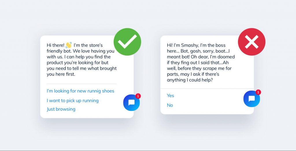
Instead, let your own automated, easy-to-setup AI chatbot take control and talk to your customers in the beginning so that you save time doing actual productive work.
Make your consumers feel welcomed every time they press the “Like” button on your page! Socioleads will automatically send a text in their inbox greeting them for their delightful user experience with your page!
Sending out broadcast messages to your entire audience has never been easier! Socioleads provides support for messaging customers in-bulk at once so that more of your time is spent on earning revenue and less time interacting with your customers.
Schedule your messages into three dedicated schedules to ensure maximum engagement and retain the interest of your consumers by replying promptly! The three schedules are:
- Step Sequence: Message goes after a specified number of days (for follow-ups) at a chosen time in the receiver’s time zone.
- Date Sequence – Message goes out at a specific date and time in the receiver’s time zone.
- Recurring Sequence – Message sent weekly at a specific time and day of the week in the receiver’s time zone.
Lastly, gone are the days when analytics used to be a subject only for the skilled! Understanding the analytics of your messages and Facebook page has never been easier, thanks to Socioleads!
Keep track of all essential indicators, such as messages, comments, likes, and fans. Find out what your users are interested in so you can provide them with more of it.
A simple and user-friendly UI lets you zoom in for a more granular view of your data or zoom out for a complete overview. Drag sideways for a fast comparison that eliminates the need for bulky date selections and perplexing menus.
To conclude this entire article into one paragraph: brands must have the perfect Facebook banner size and all the visuals nailed down to be effective and reach people from all walks of life.
But these efforts might go in vain if the leads coming from them don’t go through processing on lead-management software like Socioleads! Socioleads ensure maximum conversion from leads to sales by simplifying things done by skilled professionals back in the day.
Save your money spent on employing data analysts and check out Socioleads today!





Write a Comment